Mathematics Essentials 11 Data Management
Specific Curriculum Outcomes
F1 read and interpreting various data displays
***bar graphs-single and double; line graphs-single and double; circle/pie graphs; pictographs***
F2 select an effective data display for a given set of data and explain the reasons for the choice
F3 represent given data in a variety of displays, using spreadsheets or other technology
F4 collect, display, and analyze data to draw appropriate conclusions about relevant questions or issues
F5 use data analysis to describe trends within the context of the data and predict future trends
Activities
- The Money Duck Activity from Dan Meyer - The Virginia Candle company sells a bar of soap shaped like a duck. Inside each duck is either a $1, $5, $10, $20 or $50 bill. How much should this bar of soap cost?
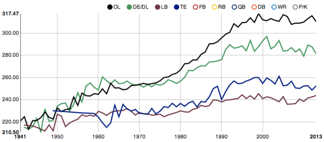
- Average Weight of NFL Rookies - A line graph comparing the average weight of NFL rookies by position. What does this say about how the game of football has changed over time? Additional data can be explored on an interactive graph online.
- Skittle Stats from Ms. Procopio - Use bags of Skittles to create bar graphs.
- Using Proportions: What If Our High School Was Our Geometry Class? from Jessica Murk - What would your class look like if it were in proportion to the demographics of the whole school? Use some proportional reasoning to scale the results of the survey to the size of your class and then create an infographic to display the results. Students used either easel.ly or Piktochart to generate their graphics.
- Shut up about the y-axis. It shouldn’t always start at Zero from Vox.com - Watch this video from vox.com about graphing axes. The truth is that you certainly can use truncated axes to deceive. But you can also use them to illuminate. In fact, you often have to mess with the y-axis in order to craft a useful image — especially because data sometimes reaches into negative territory and sometimes goes nowhere near zero. The right principle is that charts ought to show appropriate context.
